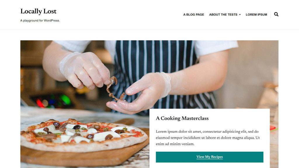
Last week, Dumitru Brînzan announced Nutmeg Plus. It is the latest commercial theme offering through his ILOVEWP brand. Earlier today, the free version of Nutmeg landed in the WordPress theme directory. The theme is built for food and recipe bloggers and is another solid example of building on the block system.
As is typical of his style, Nutmeg rests on a foundation of clean lines and readable typography. It pulls elements from some of Brînzan’s previous work, such as the featured pages section of Photozoom and the two-column intro from Endurance. Reusing code is one of the cornerstones of smart development.
The theme never gets too flashy, nor is it a bold step forward in design. However, it has a timeless layout that is hard to go wrong with.
Where it shines is in its use of block patterns and styles.

Sometimes, theme authors surprise me with, in hindsight, simple solutions. Nutmeg’s List block styles had me asking, “Why didn’t I think of that?”
Last month, I challenged theme authors to build out patterns that are often created as custom blocks. In the post, I showcased an example of how themers could provide pricing columns for their users. The Nutmeg theme is a perfect example of that same concept, only applied to recipes.
The unique aspect is that Brînzan did not make it complex. With a few simple styles for the List block, he had all the makings of the typical “recipe card” seen on many food blogs. Is it as advanced as a fully-featured recipe card plugin? No. But, that should not be the goal. If users need more advanced recipe-related features and functionality, that is where plugins make sense. The theme even recommends a few like WP Recipe Maker, Recipe Card Blocks, and Delicious Recipes for those who need more.
However, for bloggers who are just starting, undecided on recipe plugins, or simply do not want another dependency, the theme has built-in solutions for them. It is tough to discount the value in that.

With a starting point of the Recipe Info, Ingredients List, or Ingredients + Instructions patterns, users can quickly pop these sections into their content. Or, they can go the alternate route of starting with the List block and selecting one of four custom styles.
Theme authors should be able to build unique and complex combinations of blocks with custom styles. Users should be able to just make it look like the demo.
It was March 2020. The Gutenberg development team had just pushed block patterns into the plugin, but the feature would not land in core WordPress for months. I do not want to call myself a prophet. It was plain enough for anyone to see: block patterns would eventually change how end-users interact with the editor and build their sites.
Patterns were the answer to elaborate homepage setups. Instead of jumping back and forth between non-standard theme options, hoping for the best from a theming community that never learned to entirely leverage the customizer, users could simply click buttons and insert layout sections where they wanted.
Recreating Nutmeg’s homepage demo was easy. By just picking a few patterns and adding some custom images, I was up and running in minutes. No tutorial necessary. No half-hour session of figuring out a theme’s custom options setup.
- Select the custom homepage template.
- Add the Cover with Overlay pattern and upload an image.
- Drop in the Opening Message pattern and customize.
- Insert the Featured Pages pattern and add images.

Simple setup processes like this are the exact thing that theme authors have been repeatedly asking about for the better part of a decade. Except for a powerful Query solution, which is arriving in a limited form in WordPress 5.8 (the Post Featured Image block is the weak point), the tools are mostly in place. The feature set is only growing with each release.
One of my favorite solutions in the theme is the use of the Cover block’s inner container. The plugin has several styles for moving this inside box around and creating a featured section.

One improvement I might suggest is to provide “width” styles for the inner container here. Core already provides an alignment matrix option. Styles for 25%, 50%, and 75% width (100% being the default) would offer more variety when coupled with the existing alignments.
The only things that felt out of place with the theme were its alignment block styles for Heading and Paragraph blocks. WordPress already provides alignment options for these blocks. I am not sure if there is a use case that I am unaware of for the styles, but they were definitely confusing.
The theme is worth a test run for any food or recipe bloggers who need a dash of Nutmeg to spice up their site.

