When I first tried the block styles feature in WordPress, I was impressed. As a theme creator, it was a simple way of allowing users to select a design-related class without them actually needing to know what was happening under the hood. In that first week or so, I hit the problem that many others had. I wanted to combine two or more classes/styles to offer a wide range of user options.
This was back in late 2018 or early 2019 — around the time of the WordPress 5.0 release. Others have requested the ability to combine styles since, and Keith Devon, the co-founder of Highrise Digital, brought the issue up again via Twitter last week. However, these multiple requests have never resulted in a change to the core code.
This snail’s pace has been beneficial. Jumping too early on some features when others have yet to mature can create unnecessary legacy baggage.
Over the past couple of years, I have reassessed my position on combining block styles. As the editor has evolved, there is a clearer vision emerging around what options users will have. While I initially wanted to combine block styles, I am not so sure anymore. The primary reason for this is that core has already made many obsolete through block options, and it will continue to do so with other controls in the future. When WordPress itself handles this, it creates a standard that all themes can rely on.
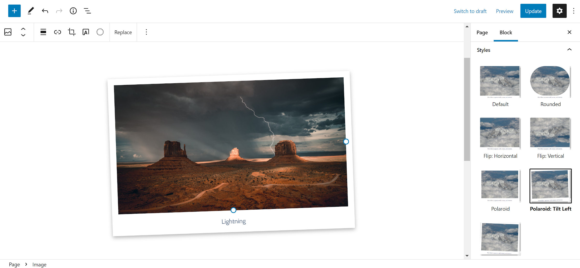
With one of those passion projects I’m building in my free time, I currently have six styles for the Image block:
- Rounded
- Flip: Horizontal
- Flip: Vertical
- Polaroid
- Polaroid: Tilt Left
- Polaroid: Tilt Right

There are times when mixing and matching some of those might make sense. For example, the Flip: Horizontal style fits well with all the others and would not cause issues when combined. I could also go overboard by adding choices to meet every possible variation.
Some combos would break down entirely or not be aesthetically pleasing. For example, the Rounded style does not work well with the Polaroid styles. However, these are simple styles that barely scratch the surface of what is possible.
Most of these are not block styles that I would want to ship with a theme. For example, the Rounded style could easily be handled via the WordPress-supported border-radius option. The Polaroid style is just a fancy name for some padding and a box-shadow on the image. These are all standard design features that should eventually be a part of the base editor experience.
Currently, themes that ship such styles are filling in the gaps where WordPress has yet to do so. In the short term, theme authors must cater to their user base. However, down the road, WordPress should offer a more robust set of tools that cover the basics. There really is no reason for every theme to have a different, non-standard slug (i.e., class name) for essentially the same block styles (e.g., Polaroid vs. Framed vs. Borders). It creates cross-theme compatibility issues that we should avoid when possible.
Block styles are handy for introducing quick methods for achieving these fundamental design options, but I am looking at what they should be for the long term. If core WordPress evolves to the point where it makes most of these styles obsolete, what should theme authors do with the feature?
That is where more specialized block styles make sense. The goal is the same: fill in the gaps that WordPress leaves open.
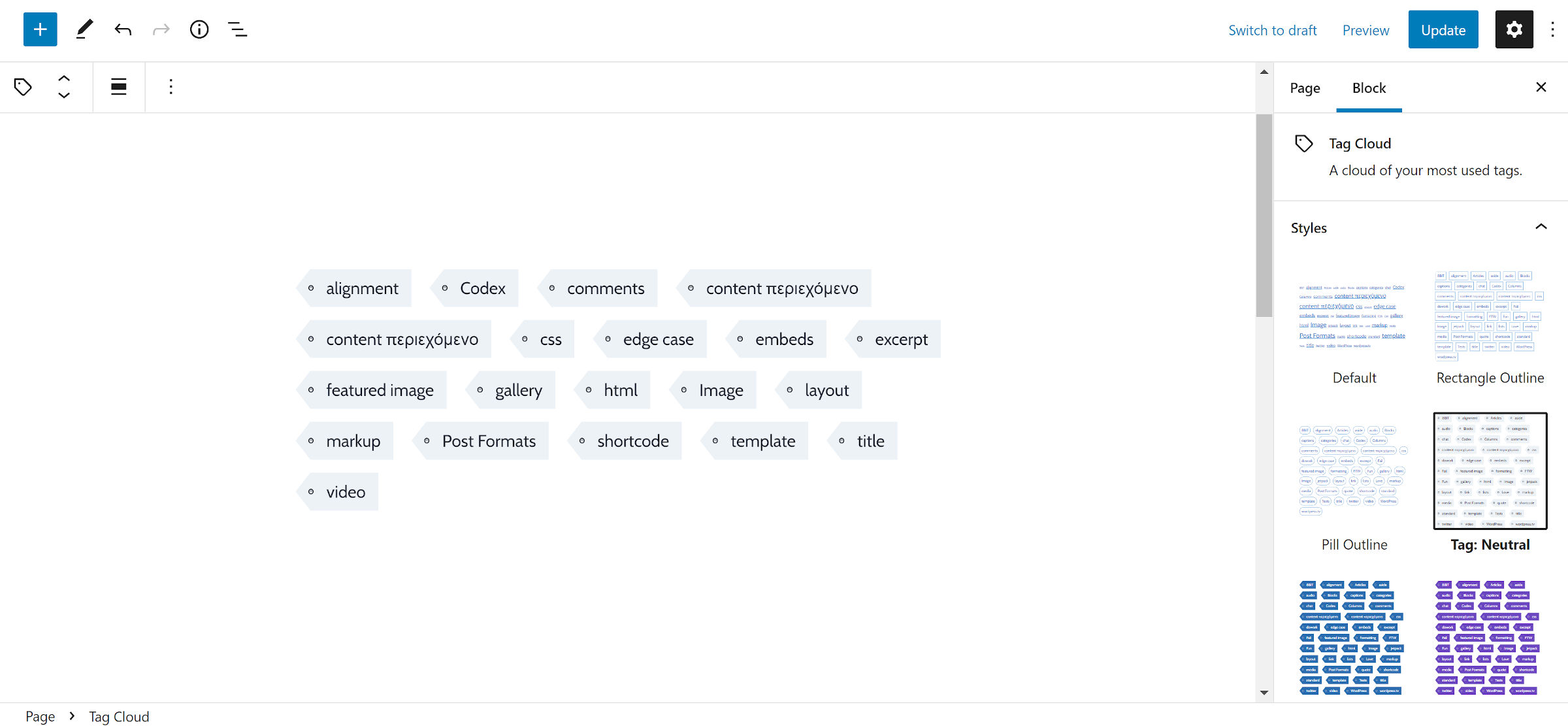
One example that would be tough to replicate with simple design options would be a tag/label style for the Tag Cloud block, as shown in the following screenshot.

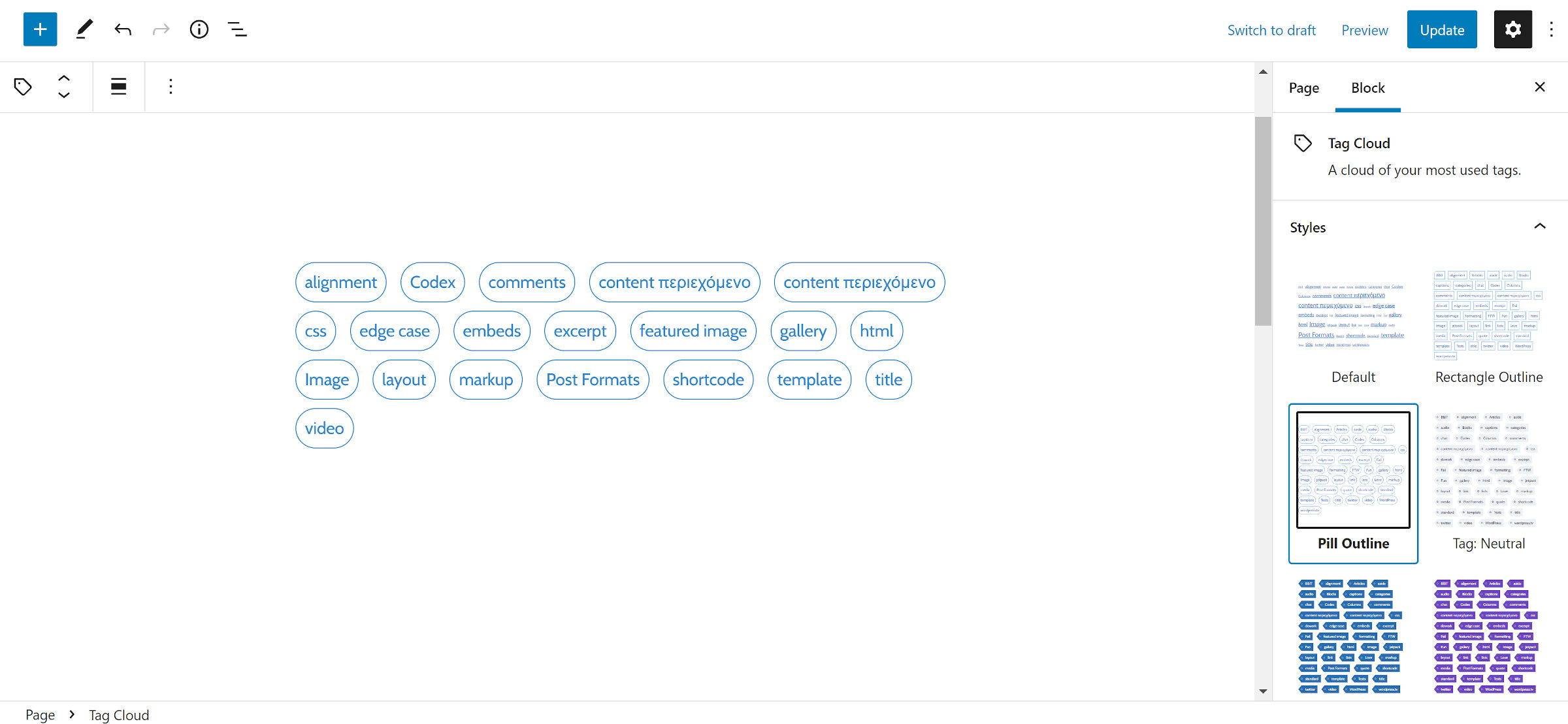
I also have a Pill Outline style for the same block:

Obviously, those two styles would not work together. Creating a system where users could choose both would result in some problematic outcomes. The more complex any two block styles become, the more likely they will conflict with each other.
Right now, it is too early to commit to a multi-select feature for block styles. We need to let this thing play out a bit and give the core design tools a chance to catch up. We can reevaluate when most of the blocks packaged with WordPress have a broader set of styling options.
At that point, it may even make more sense to begin using block variations, an API that allows developers to preconfigure block attributes. If a solid set of design options exist, it would be simple to offer multiple combinations out of the box for users.
In the meantime, I would like to see a reevaluation of the UI for block styles. Shaun Andrews has an in-depth piece, Thinking Through: Switching Block Styles, that explores various options on how we could iterate on it.
