Now that WordPress is a full-featured Content Management System (CMS), it needs more tools to help create stellar websites. The native Block Editor is a step in the right direction, but in this Elementor review, we’ll showcase the clear leading competitor to the platform’s creative vision.
On the surface, Elementor is another in a long line of page builder plugins with increased scope over what WordPress offers out of the box. On close inspection, it’s almost a framework in itself. You could conceive a website and content using the functionality available, without breaking into WordPress’ toolset.
For this Elementor review, we’ll look at how to use the page builder to develop layouts. What’s more, we’ll try and compare it to the Block Editor, and judge its future within the WordPress ecosystem.
Elementor Review: Introducing the Page Builder
Unless you’re super-new to WordPress, you’ll have heard of Elementor. After all, we’ve featured it on the blog many times over the years. It’s a page builder plugin at heart that has rocketed to become the most successful WordPress plugin of all time.
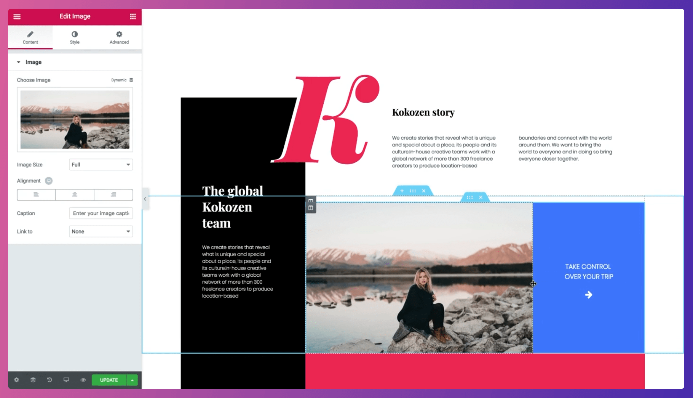
It provides you with a strong and robust set of customization options to help take a literal blank page and turn it into a site matching your exact requirements.
Digging deeper into what’s on offer, there are many strings to Elementor’s bow:
- Editing. You have a full suite of tools to help construct layouts, starting with the drag-and-drop live editor. There are a few cool User Interface (UI) and User Experience (UX) inclusions too, such as the Navigator and Finder.
- Design. Apart from the extensive layout options, you can also work with typography and colors as you would with a high-powered graphic design tool. Along with basic customization, you have almost limitless scope for adding interactive, dynamic animations, micro-elements, and much more.
- Marketing. Elementor includes a few different aspects to market your site. For instance, there’s a built-in form builder; a bunch of widgets to help you add a Call To Action (CTA), pricing tables, social media icons, testimonials, and more; counters; and much more besides.
- Element Builders. We’ve mentioned the form builder, but there’s also a comprehensive pop-up builder, WooCommerce builder, and theme builder too.
The general goal of Elementor is to give you almost zero reason to go searching for another creative plugin on your site. The development team look to add all the practical features you need to build and launch your website.
We’ll have more to say on each of these aspects later. For now, let’s discuss Elementor’s place within WordPress.
How Elementor Fits Into the Rest of the WordPress Ecosystem
Before Elementor was released, page builder plugins were functional and solid. The likes of Beaver Builder (see our review) ruled the roost, and the flexibility of that plugin is still evident today. Though, once Elementor arrived, it changed the game. There were more options to change every aspect of your site, and also so-called ‘front-end editing’ that showed how your site would look.
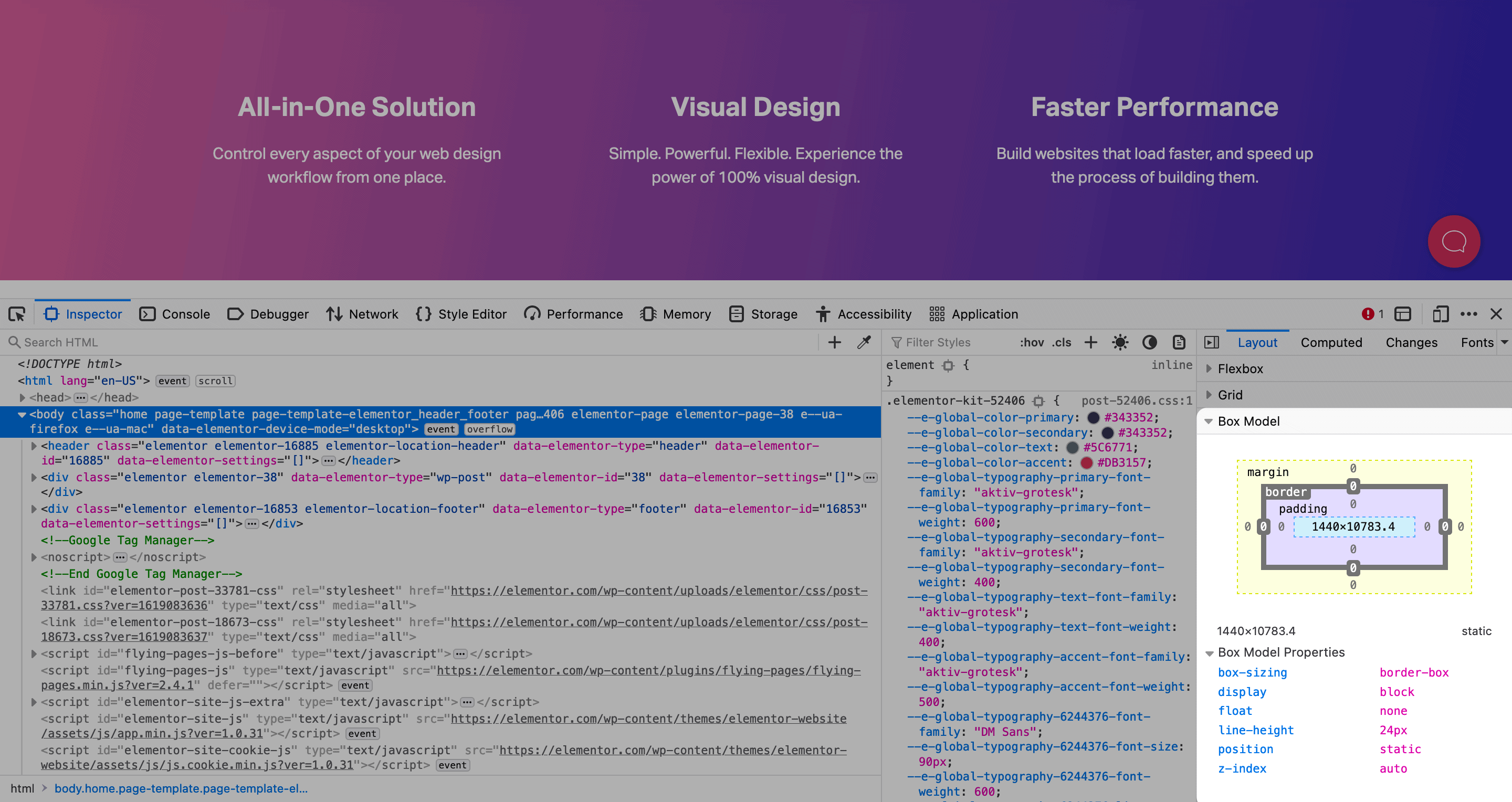
The big talking point at the time centered around how adaptable the editor is when building layouts. You can be almost pinpoint accurate when it comes to implementing the ‘box model’ on your site. It’s a graphic designer’s (and front end developer’s) dream:
Though, as Elementor has evolved, it’s gained more ground in areas outside of editing. For example, form plugins can’t rest easy – Elementor’s built-in form builder does away with the need for a third-party plugin. Other WooCommerce themes will sweat too, as Elementor lets you create a fully-functional store with its toolkit.
In fact, almost no niche is safe when it comes to Elementor’s offerings. Because of this, the user base has shot up. It helps that there’s a huge community initiative too – almost as vibrant as WordPress itself.
It’s understandable that WordPress’ top brass are hot under the collar. The Elementor team has come under fire due to misleading ads that undermine the WordPress project. Given that the Block Editor is front and center when it comes to WordPress’ key selling points, a solution such as Elementor bundled with its own blank starter theme is trouble.
On the whole, the next phase of WordPress will be a fight between Elementor and the Block Editor. This is good for competition, although it could mean huge fallout in the near future.
Elementor’s Competitors (And How It Stacks Up)
As we’ve touched on, there are a few competitors chasing Elementor right now. The Block Editor is (of course) the primary target because it’s a native way of building a layout within WordPress.
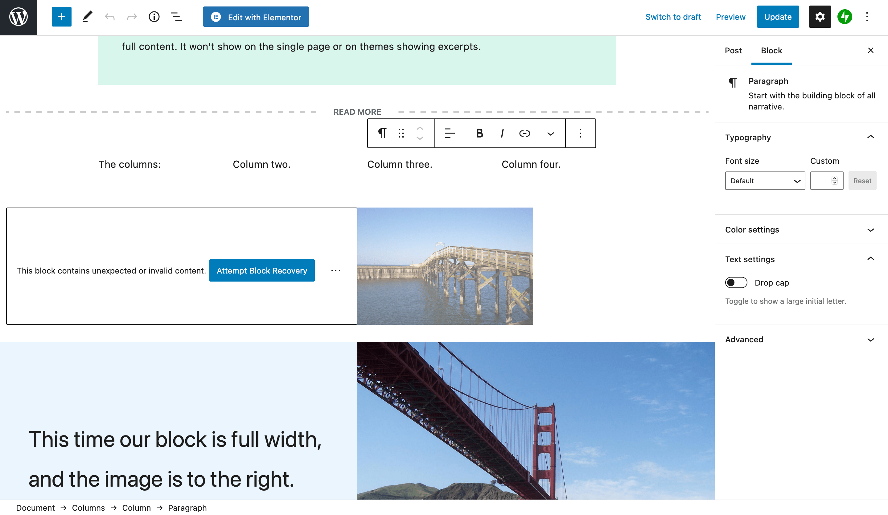
Right now, the Block Editor can’t touch the breadth and depth of Elementor’s functionality. Though, the core development team are all hand on deck to try and bring Full-Site Editing (FSE) to the masses sooner rather than later. When this happens, expect fireworks between leading WordPress figures and Elementor.
There are also other page builders vying for attention – the most notable being Beaver Builder:

This is another solution we’ve talked about before on the blog, and it has a different aesthetic and goals to Elementor. You could argue that Beaver Builder is more focused on building layouts, rather than becoming a framework within WordPress. Though, it’s fair to say there are hardcore fans of Beaver Builder as much as there are Elementor.
The previous ThemeForest darling in the WPBakery Page Builder is falling behind as a go-to solution as well. Even a cursory glance at ThemeForest’s marketplace will show you that Elementor is mentioned just as much as the previous Visual Composer.
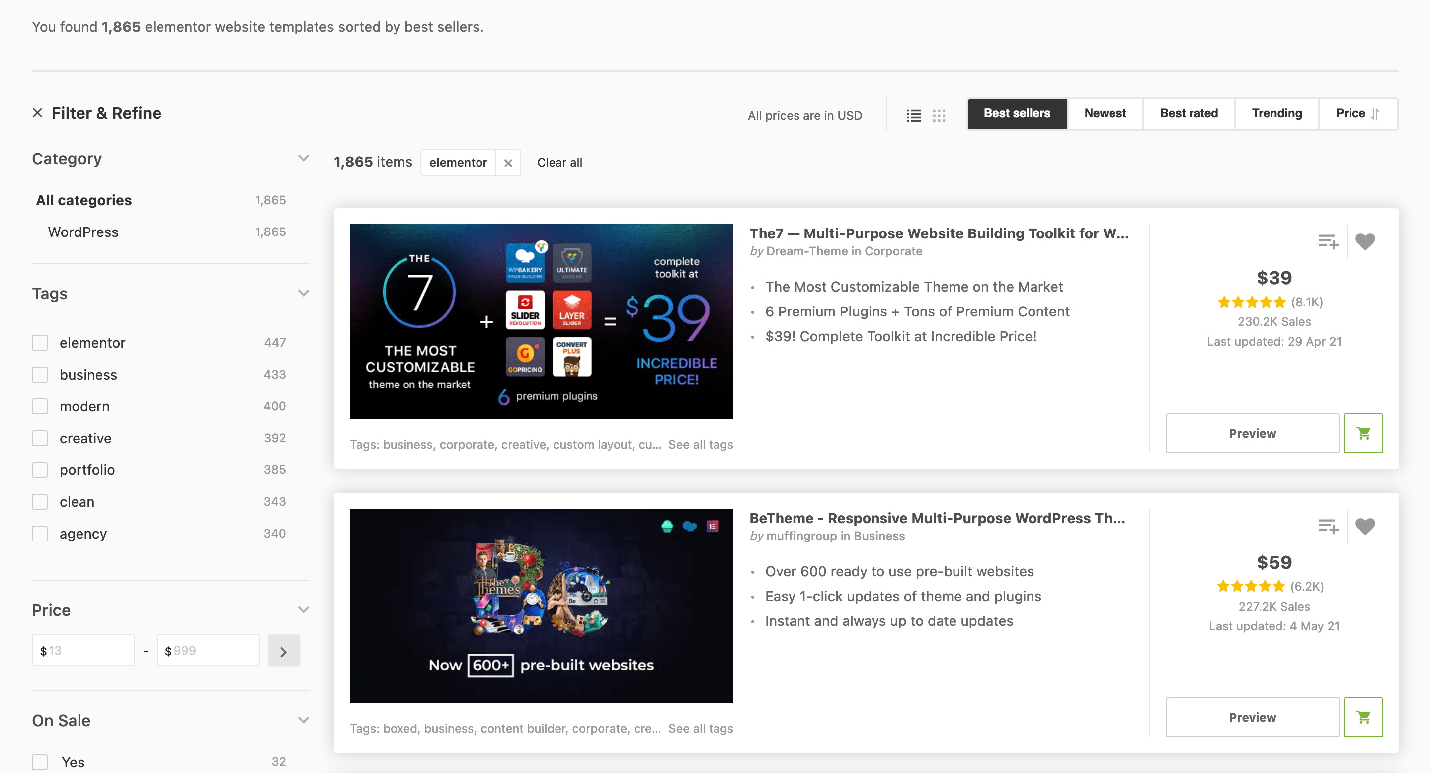
There are a bunch of other page builders on the market, such as the Divi Builder, and even full themes such as Avada. Though, it appears as though there are two camps – plugins that lock you in using shortcodes and custom infrastructures, and those such as Elementor that don’t. The public is voting for no lock in, and it will be interesting to see what the likes of Divi, Avada, and even WPBakery do in future.
Elementor’s Pricing
Before we get onto real-world use in this Elementor review, we want to talk pricing. This is one aspect that the page builder stands tall on. There are five premium tiers to choose from: Essential, Advanced, Expert, Studio, and Agency. Other than a few tweaks to the support provisions, the main difference is how many sites each tier will support.
You’ll pay at least $49 per year for one site, and this rises to $999 per year on the Agency plan for 1,000 websites. This author isn’t experienced enough to know whether higher tiers represents value for money, although the bottom two tiers do.
The real kicker for users is that Elementor offers a jam-packed free tier:

In fact, you’ll need to install the free plugin in order to give you access to the premium version. It’s a top-notch way to develop a user base, and we’d argue it’s one of the big reasons for Elementor’s success. Other leading page builders eschew free tiers altogether. The outlier – Beaver Builder – is so crippled that it’s a practical demo of the full plugin.
Elementor Review: How to Use the Tool to Create Layouts
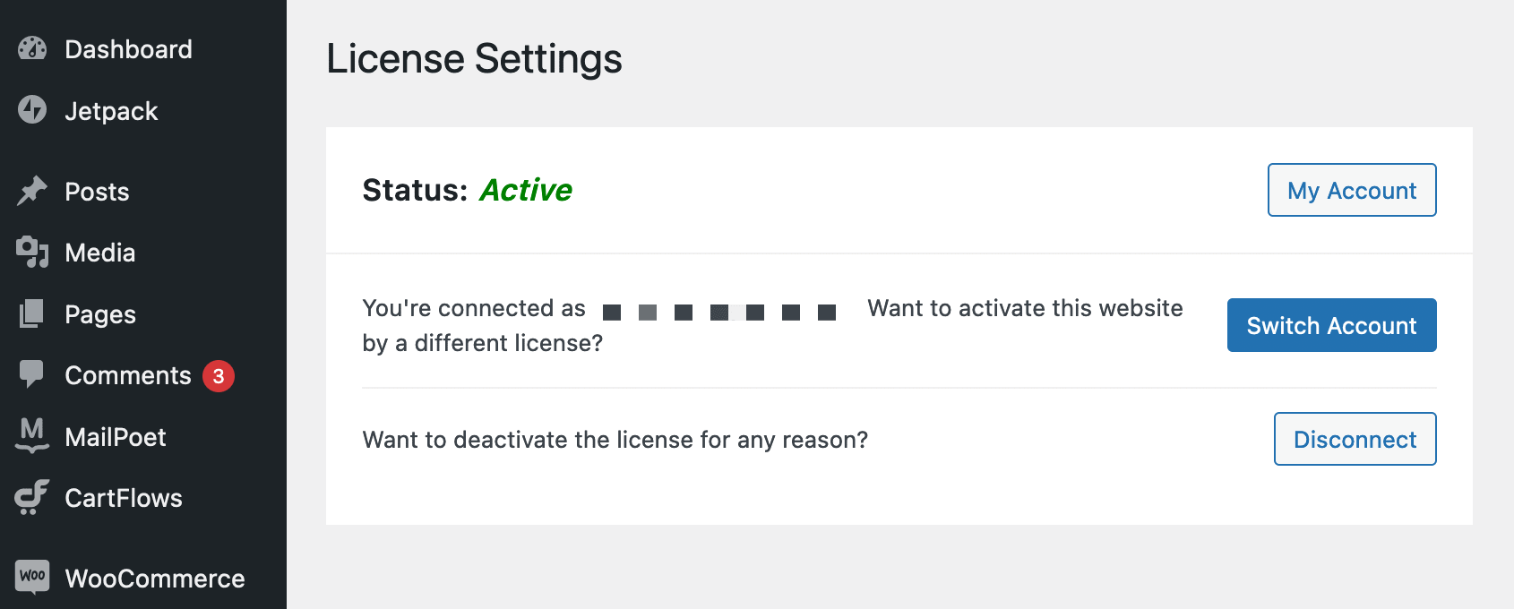
For this section, we’re going to use Elementor as a user would, rather than run through the features as a list. As such, let’s talk installations. It’s a standard way of upgrading a free plugin – you activate an extra plugin to unlock the premium features. You have a basic License Settings screen where you connect your site to Elementor’s web-based dashboard and check on the status:
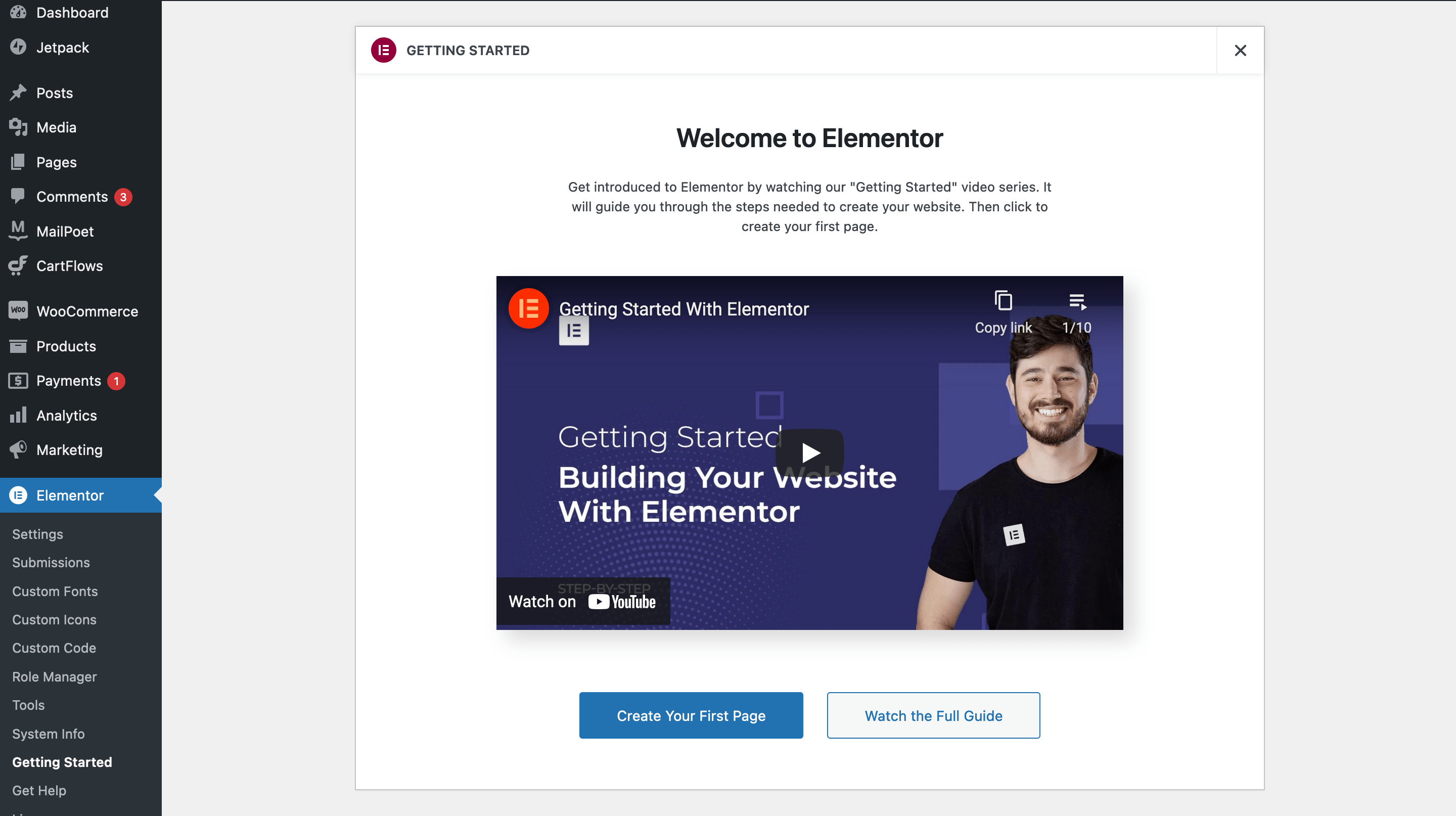
Once you’re ready, you’ll want to watch the Getting Started guide (found at the Elementor > Getting Started page) to find out the basics:
Once you go to create a new page, you’ll come to the main Elementor screen (although you may have to click the Edit with Elementor button in the Block Editor).
This is where the magic happens, and when it comes to editing the page and creating your layout, its straightforward. There’s a drag and drop editor on the left-hand side, and those elements are pulled onto the edit canvas. Though, if you take a look at the center of the page view, you’ll notice an Add Template button:
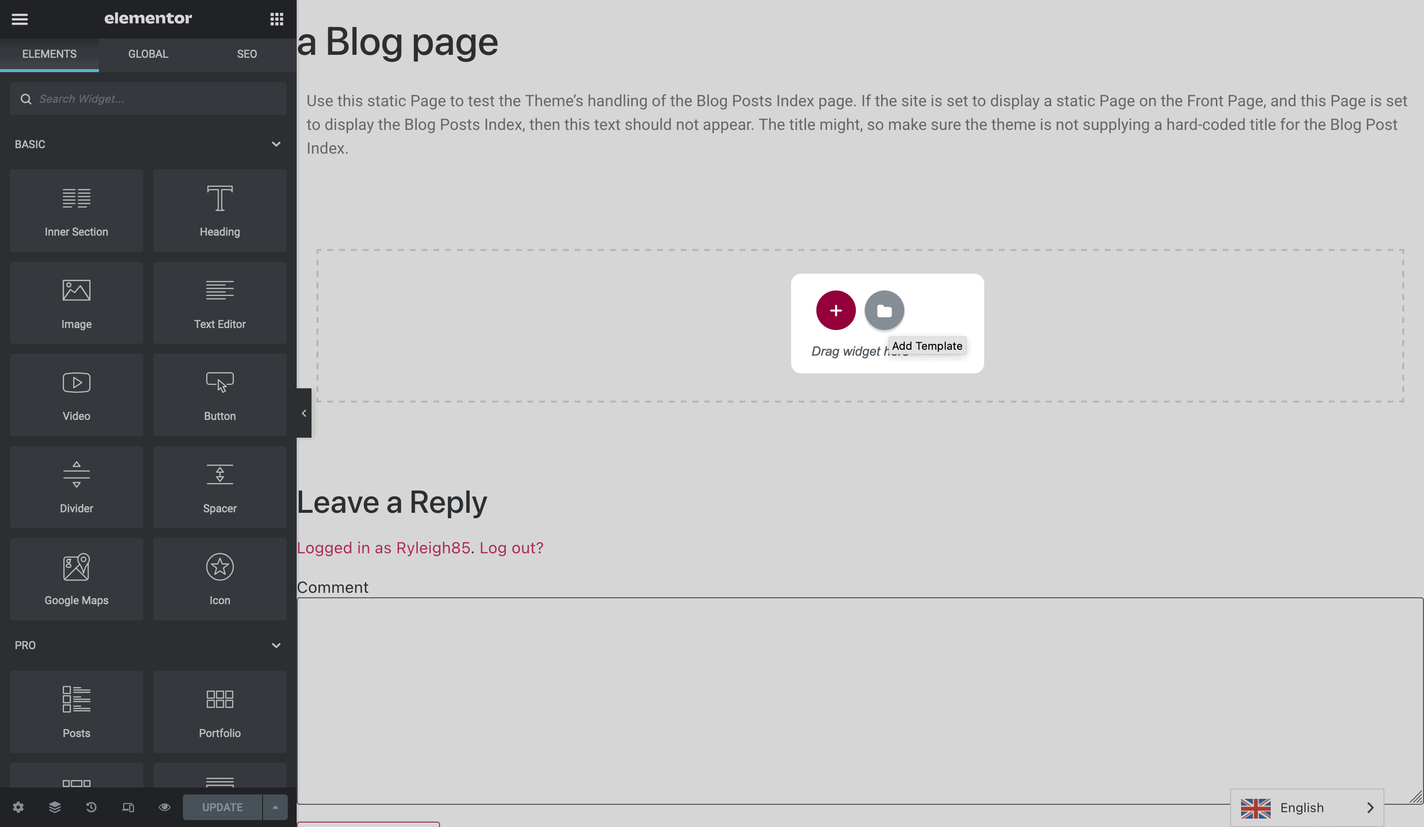
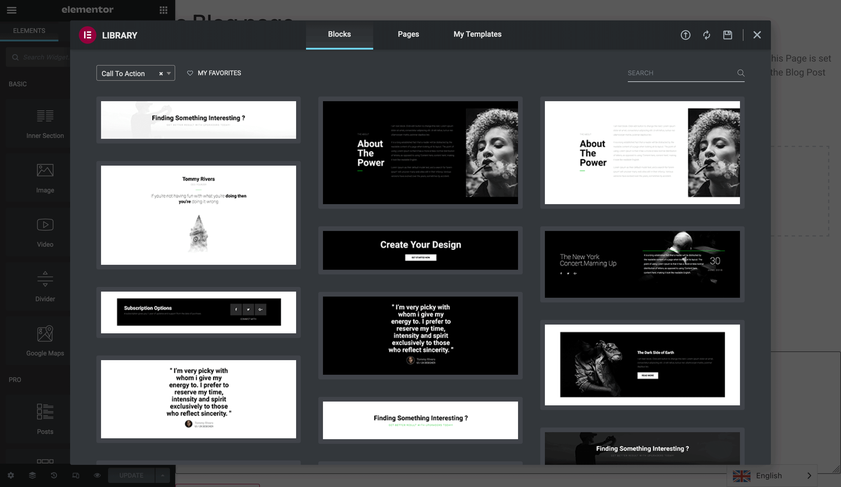
Adding this will give you access to one of Elementor’s top features – the Blocks and Pages libraries. These are full collections of pre-built elements to help you cut down the time it takes to create your pages. The Blocks Library offers a drop-down of elements that span almost all aspects of creating your site.
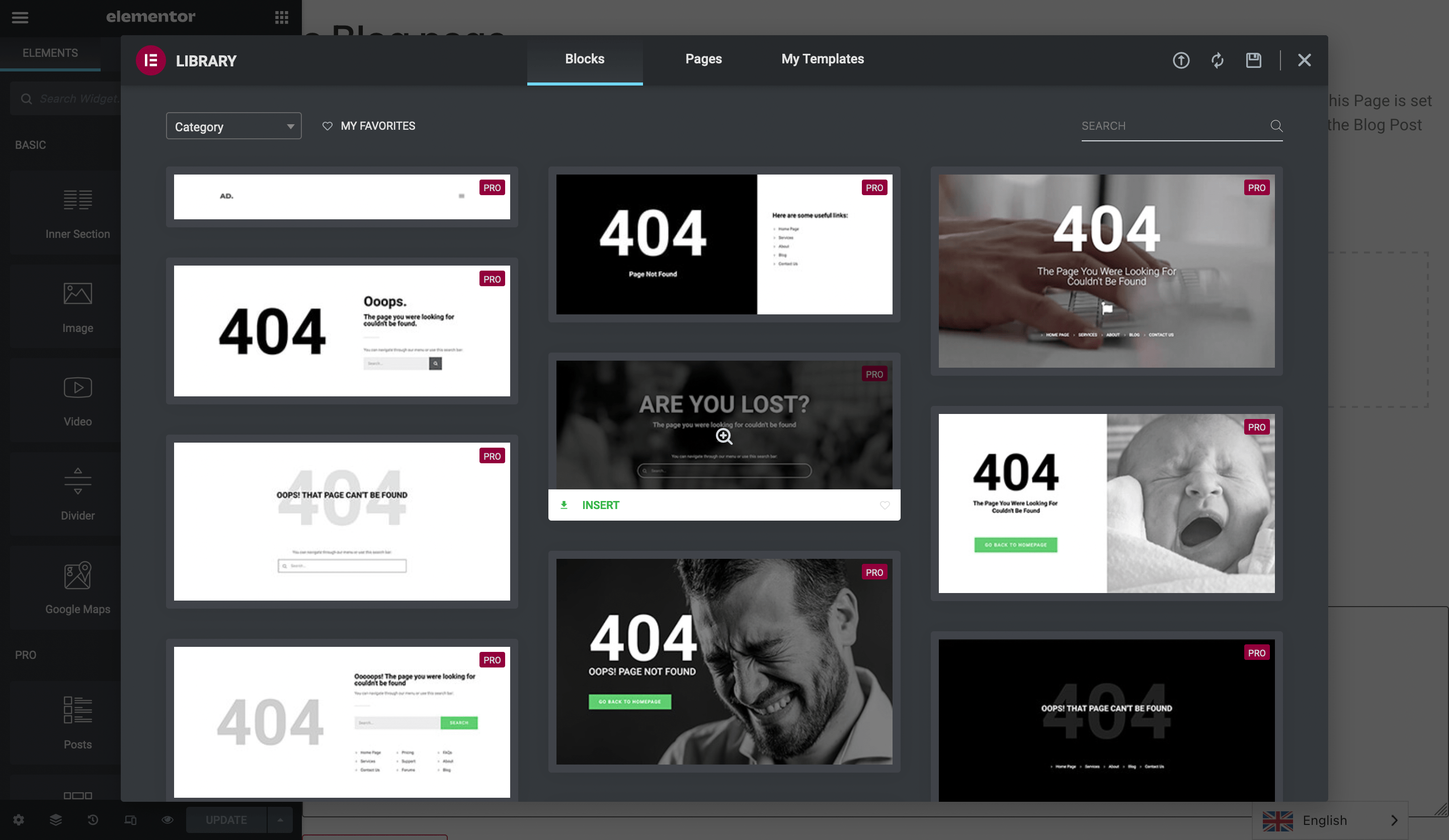
For example, you can choose standard modules such as testimonials and team profiles. Though, you also get to choose 404 elements, CTAs, and more.
The Pages Library is a natural extension for Blocks – you’re able to choose from full pages built with collections of Blocks, and the results are stunning, ready-to-roll examples of websites:
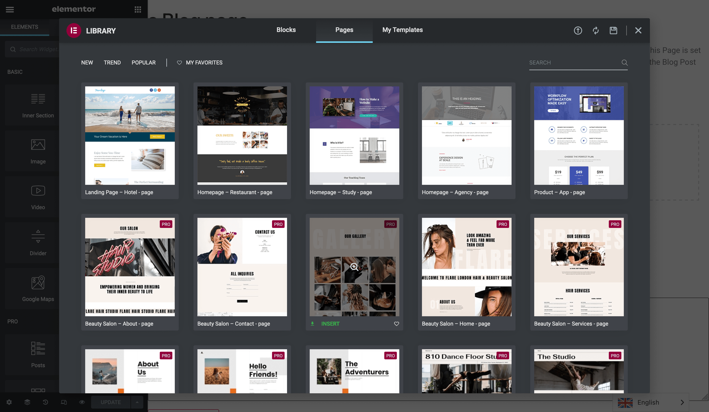
Using them is a case of selecting those you like and pressing Insert. From there, you have full control over how the page looks, and can built on top of what’s there.
We could get into more of the features of Elementor, such as the theme builder, but the functionality is similar to the main editor. For us, Elementor could do better to display some of its deeper options to where users can get at them.
Right now, some users are going to feel overwhelmed with what’s on offer, and aren’t going to be able to navigate the wealth of options. For example, global typography settings are nested three levels deep, under a hamburger menu. They should be front and center, or at least more visible:
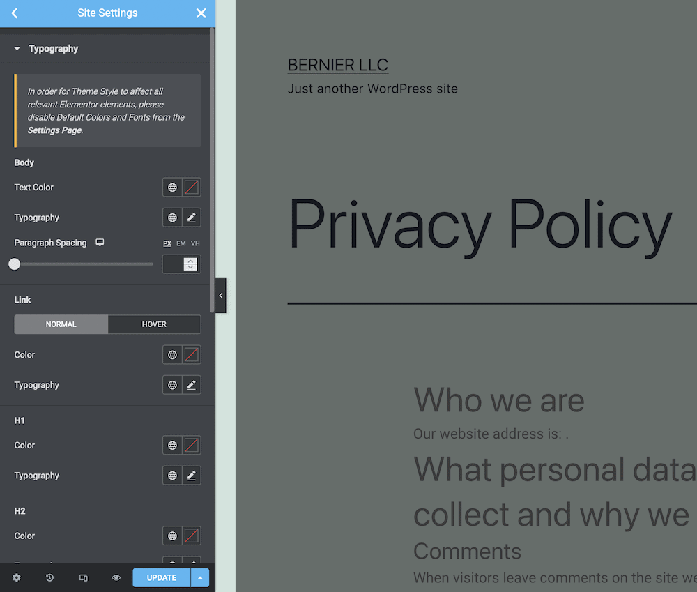
We’d like to see more in the way of visual help and guidance for users. How this is implemented could take a few turns. Though, some of Elementor’s immense functionality is going to be either wasted by not being found, or discovered by frustrated users who had to crack open the documentation.
The Verdict of Our Elementor Review
It’s hard to compare Elementor to some of its competitors, because they’re on different schedules. Elemetor has had longer to hone its features and functionality, and as such, it’s in a different place. You could argue that the Block Editor is in the same place Elementor was early in its launch. The focus then was on flexible and creative layout building.
Though, now Elementor has that nailed, its turning its hand to other areas such as forms, pop-ups, and other site aspects. Meanwhile, the Block Editor is blooming into a way to develop your entire site. On paper, Elementor is miles ahead. In the real-world, the Block Editor might win the war based on its leadership and development team.
Our opinion is that Elementor has a deserved place at the table right now. The Block Editor is good, but Elementor can do more, and with less fuss than any other solution available. Yes, some themes and plugins look better and are more intuitive on a subjective level. Though when it comes to scope and grunt, Elementor rules all.
Wrapping Up
Having a powerful way to create your website is a necessity for modern WordPress. This is part of the reason for the Block Editor’s development and evolution. Though, the native tool isn’t the only one around – Elementor is hot on its heels and winning the race so far.
This Elementor review has looked to show how the page builder operates and works within the whole WordPress ecosystem. The main difference is that Elementor can help you build the entire site from header to footer. Until the Block Editor launches FSE, it’s behind the third-party solution. Though, given the reaction of WordPress’ leadership, it’s doing a lot of things right by its users.
Are you a fan of Elementor, and has this review helped you make a decision on whether you’ll use it? Let us know in the comments section below!

