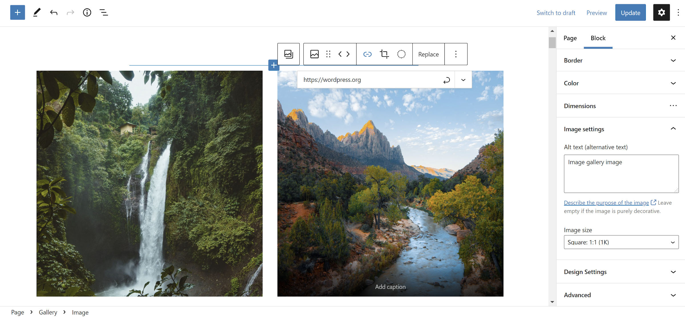
Last week, a GitHub pull request I had been watching since October 2020 on the Gutenberg repository was finally merged into the codebase. It changes the structure of the WordPress Gallery block to be a container for nested Image blocks. The new format is expected to land in WordPress 5.9.
For those who want to begin testing it early, it should ship with Gutenberg 11.4 next week. However, you can grab the nightly test version from Gutenberg Times to see it in action now. To use the new Gallery format, you must enable it from the Gutenberg > Experiments admin screen.
“If you have ever added a custom link to an image block and then tried to do the same on a Gallery image, you will understand the frustration and confusion of not having consistency between different types of image blocks,” wrote Glenn Davies in the refactor announcement post. “This inconsistency is because the core Gallery block stores the details of the included images as nested <img> elements within the block content. Therefore, the images within a gallery look and behave different from images within an individual image block.”
At the surface level, the Gallery block refactor does not change much for many users. They will still add images to galleries as they have for years. However, for more advanced usage, it opens a world of possibilities.
One oft-requested feature is the ability to add links to individual images in galleries. In the past, users could only link to attachment pages or the media file itself. Both options applied to all images. With the most recent change, users can modify each Image block, including customizing its link.

While this allows for handling something as simple as links, there is so much more that users could do.
In a theme that I have been building, I have a custom Gallery block style that allows users to create a group of images with a Polaroid-style frame around them. It is something fun for folks who do not want the all-business-all-the-time look. Sometimes, I like to throw in a bit of whimsy.

The problem with that block style is that it does not go far enough. For example, I also have Tilted Right and Tilted Left styles for individual Image blocks. However, users are unable to apply those within a Gallery. It would be easy to make those available to the entire set or randomize different “tilt” styles. However, the ideal method would be to control the design at the Image level.
The same is true for other options. Users could do something fun like add block styles and mix in custom colors, borders, and more.

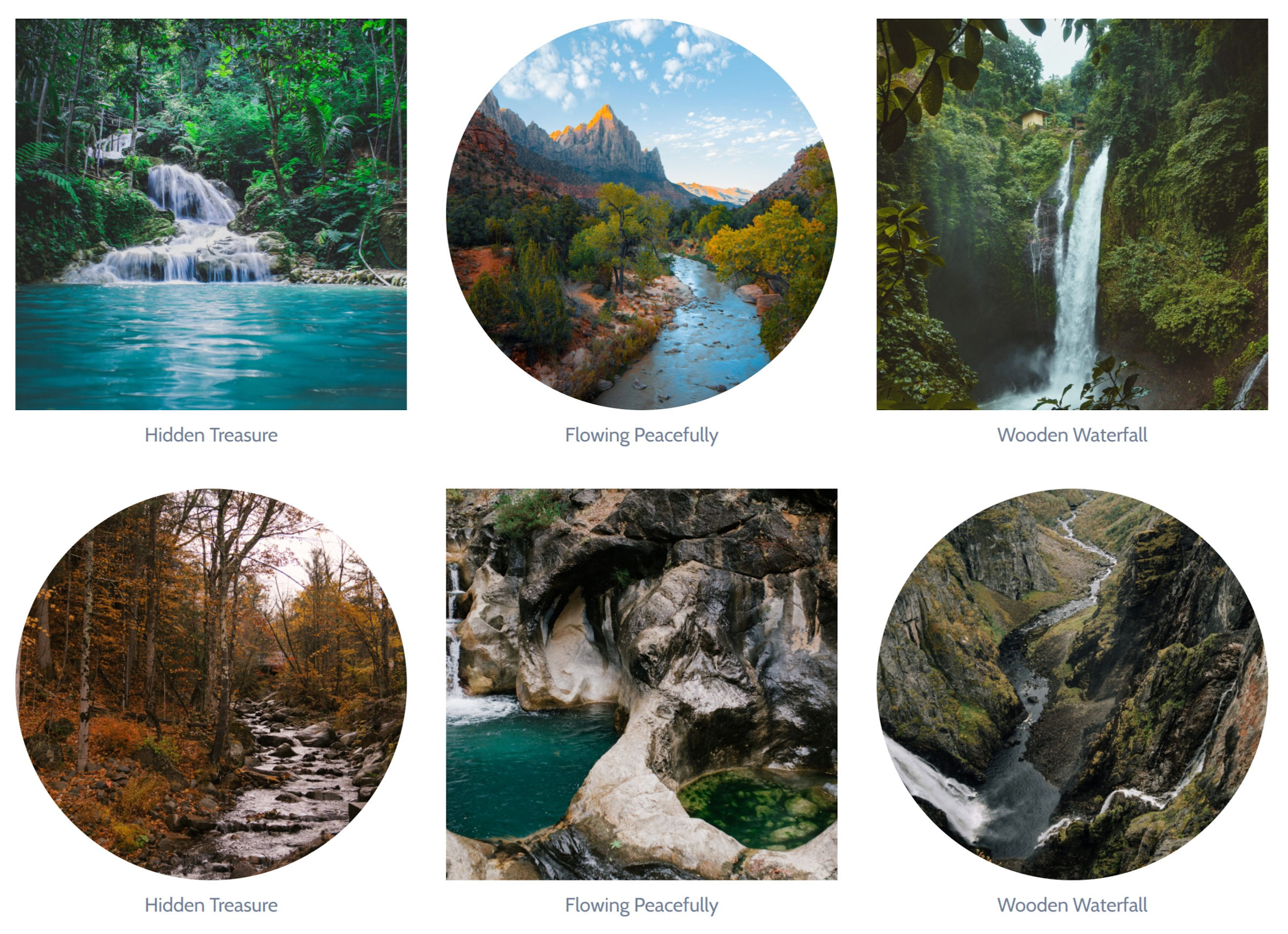
There are other fun things users might be able to do, such as alternating square and rounded styles:

The new structure may not be without some issues early on. WordPress will likely continue supporting the old format for a while for backward compatibility. All new Gallery blocks will be in the new. However, core should eventually automatically transform the old markup over.
Theme authors who have added custom CSS will be those with the most potential work ahead. Attempting to support both the new and old markup could be an exercise in frustration. The new Gallery block has broken output with my custom theme — margins and widths are off.
All styles for the new format begin with, at least, .wp-block-gallery.blocks-gallery-grid.has-nested-images. This will likely overrule custom theme styles. I have yet to figure out the obsession with chaining selectors in the core code. It creates a ton of code bloat and forces theme authors into a specificity battle. I am hoping this gets dialed back a bit. Either way, theme authors have plenty of time to test and implement any fixes if needed.
In the long term, I am excited about the potential of breaking away from the idea of just adding images to galleries. For example, I would love to see a grid option for something like the following:

Nesting a quote in the middle of my image gallery could be a fun block pattern idea that does not rely on a mishmash of stacked Column blocks. We will see what the future holds.
For now, turning Gallery blocks into containers is a welcome step.
