It was the early days of the Gutenberg project. Many on the Theme Review Team and those in design circles were trying to wrap their heads around this new concept called blocks. In particular, we wanted to know how it could be applied to theme development. There were many discussions on the pros and cons of the early editor. Overall, there was a bit of cautious excitement in the air, our optimism tempered by a buggy version of alpha-level software.
The block system could potentially solve one of the biggest hurdles of theme development: inserting default/demo content for a full page into the editor.
I cannot remember who initially explained the idea, but it was a lightbulb moment for many at the time. The general concept was pre-building a custom homepage or any page design that users could choose visually. It would all be done through a standardized block system, and we would no longer need to rely on piecemeal theme options, third-party plugins, or attempt to work around the review team’s “do not create content” guideline.
No one really knew how this would work in practice, but we understood the theory of how it would make the life of a theme developer much simpler.
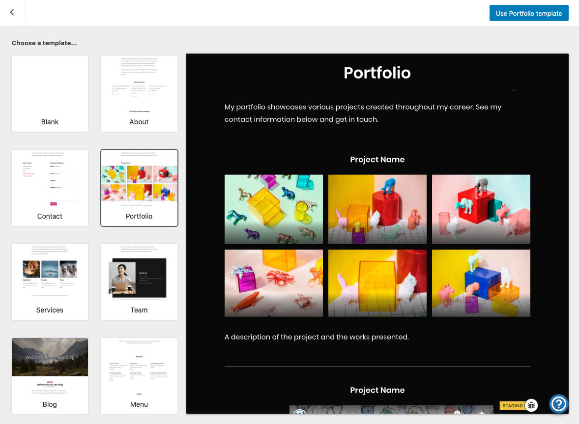
In October 2019, Automattic developer Jorge Bernal opened a ticket titled Starter Page Templates. His team was working on a template selector for mobile apps, and the WordPress.com Editing Toolkit already had the feature. The goal was to bring it to the core platform, allowing third-party theme designs to build on top of it.

Because the term “template” is overused in the WordPress space, I will refer to these as “page patterns.” This naming convention was coined by Noah Allen, a software engineer for Automattic, in the ticket. It makes sense because we are actually talking about a page’s content rather than the wrapping template.
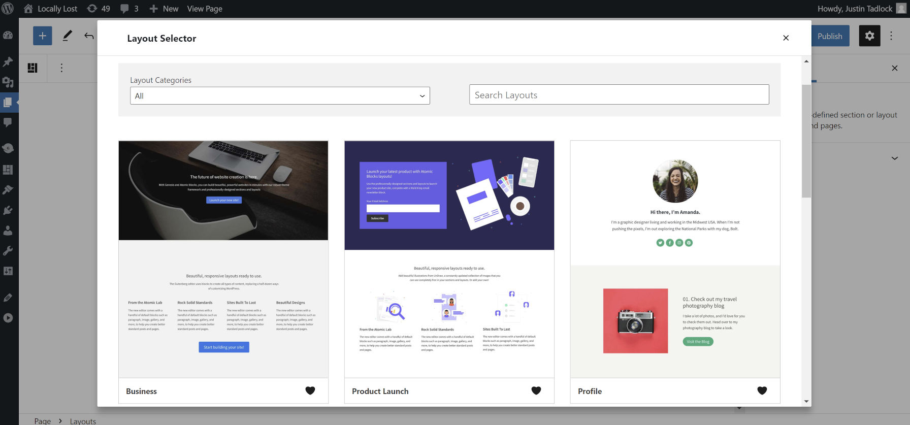
The Genesis Blocks plugin is one of the best ways to understand the page pattern concept. It has a Layouts button at the top of the editor that, when clicked, creates an overlay of designs to choose from.

These designs are split between sections and layouts. Sections are the same thing as patterns in core WordPress: small, reusable pieces of starter content. Layouts are full-page starting points for users to create various types of pages.
The StudioPress/Genesis team was not the first to market this concept. However, they have created a well-rounded user experience on top of the WordPress editor.
You will find similar experiences via GoDaddy’s onboarding process for its managed hosting service. The Redux Framework allows much the same, and Editor Plus offers templates and patterns from the Extendify library.
That initial excitement has waned a bit. It felt like that early promise was a dream that would never be a reality.
Theme authors, especially in the commercial space, have long offered home-brewed solutions for the one-click insertion of full-page content. Whether via a ThemeForest project or a popular theme on WordPress.org, there are endless examples of everyone solving the same problem. One might even argue that these custom inserters are so ingrained into theme agency systems that anything WordPress offers at this point will not appeal to those who have already brought their solutions to market. Where the core platform has failed to meet user demands, our development community has stepped up.
Some of you may be thinking that the current block patterns system works for this. Yes, and no. Theme authors could shoehorn full-page designs into it, but the user experience is lacking compared to third-party solutions. Patterns today are one of the best theming tools available, but they fall short of what is needed to see this thing through.
The foundation of this feature exists via the Patterns API. From the theme author’s perspective, they merely need a method for flagging a pattern as a full-page layout, separate from the others. However, the UI and UX flow need an overhaul. The flyout panel for the current inserter does not cut it, especially on large screens. A fullscreen overlay has become the de facto standard among other systems.
Users should also have another option between selecting from an existing page pattern or starting empty upon creation.
“I think this would be so useful to have in the core,” wrote Ana Segota of Anariel Design in a recent comment on the ticket. “I created 2 FSE themes so far and also our latest premium theme is made with block patterns and this is exactly what I thought and talked with few people about. It would be great when a user opens a new page, to chose design/page patterns however we called it and it starts editing it right away. Most of the users just want to add a page, choose a layout and start adding their content.”
Of course, this is not a revelation to the average theme author who works with end-users daily. Inserting or importing entire page designs into WordPress is one of the most common requests. WordPress is almost there with its current patterns system. We just need to take it to the next level.
