I am about a month away from my second anniversary writing for WP Tavern. There has been one project that I have followed since the beginning of this journey. In some ways, we are learning the ropes and growing in this block-based WordPress era together.
In 2019, just before taking on this role, one of the first story notes I jotted down was some thoughts on ElmaStudio’s Aino Blocks plugin. However, it was not until nearly a year later when the team took the project out of beta testing, and I followed up with a review of the flagship Aino theme and plugin.
Perhaps it is fortuitous that the team recently released version 2.0 of its theme at just about the same time I started taking stock of my time at the Tavern. Maybe this is fate’s way of telling me that we should always have a yearly update on Aino — sound like a good idea?
It also did not hurt that Matías Ventura, the Gutenberg project lead, name-dropped their work in a conversation we had last week. “It fills me with joy when I see initiatives like [Aino] built by just a couple folks,” he said. “Apart from the user aspects of our work, it’s what makes it all worth it.”
This was part of a more in-depth discussion related to the barriers to entry in the modern WordPress era. We agreed that one of the easier onramps was theme creation and site design, a focus area for Aino.
It was time to dive back into the project. I had not looked into it deeply enough since my last review a year ago.
Admittedly, at the time, I had mixed feelings about it. I initially thought the plugin launched too late. It seemed to be yet another block library after larger companies beat them to the punch.
Ellen Bauer, who co-owns the company alongside Manuel Esposito, encouraged me to check back in as they continued building. They were merely setting the stage for their vision.
“We wanted to release the Aino blocks and theme on WordPress.org since they are stable to use right now,” she wrote in the comments. “But the actual work is just starting for us, since we are now creating block patterns for our system, and I think it is only then that users will see why we built the theme and blocks in a certain way.”
A Year Later

The ElmaStudio team is taking that leap that most theme companies will inevitably need to take. They announced that Aino 2.0 ditched its classic garb and moved to 100% blocks earlier this month.
For this particular theme, the move was not as monumental as it would be for others with more intricate layouts. Aino itself was always a minimal design, more of an open canvas for blocks than anything. It is the sort of theme meant to get out of the way and allow the user to create individual pages from the ground up.
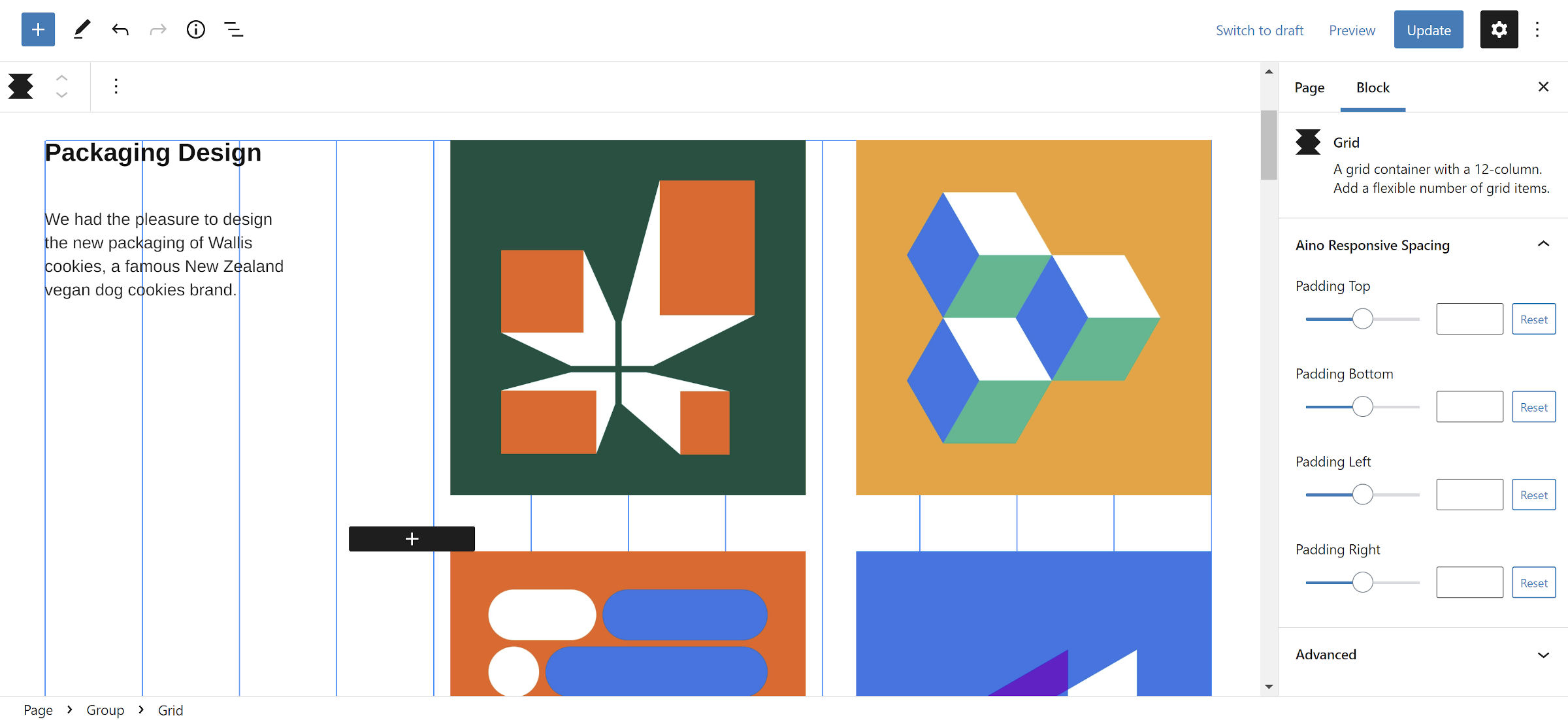
That may have been its downside a year ago. The team had built a plugin for easing users into the page-building process, but its single block pattern did not provide much of a starting point. Its Grid block is a powerful tool but also feels like it is catered more toward designers/developers. Its options may be too advanced to some end-users depending on their familiarity with CSS terminology.
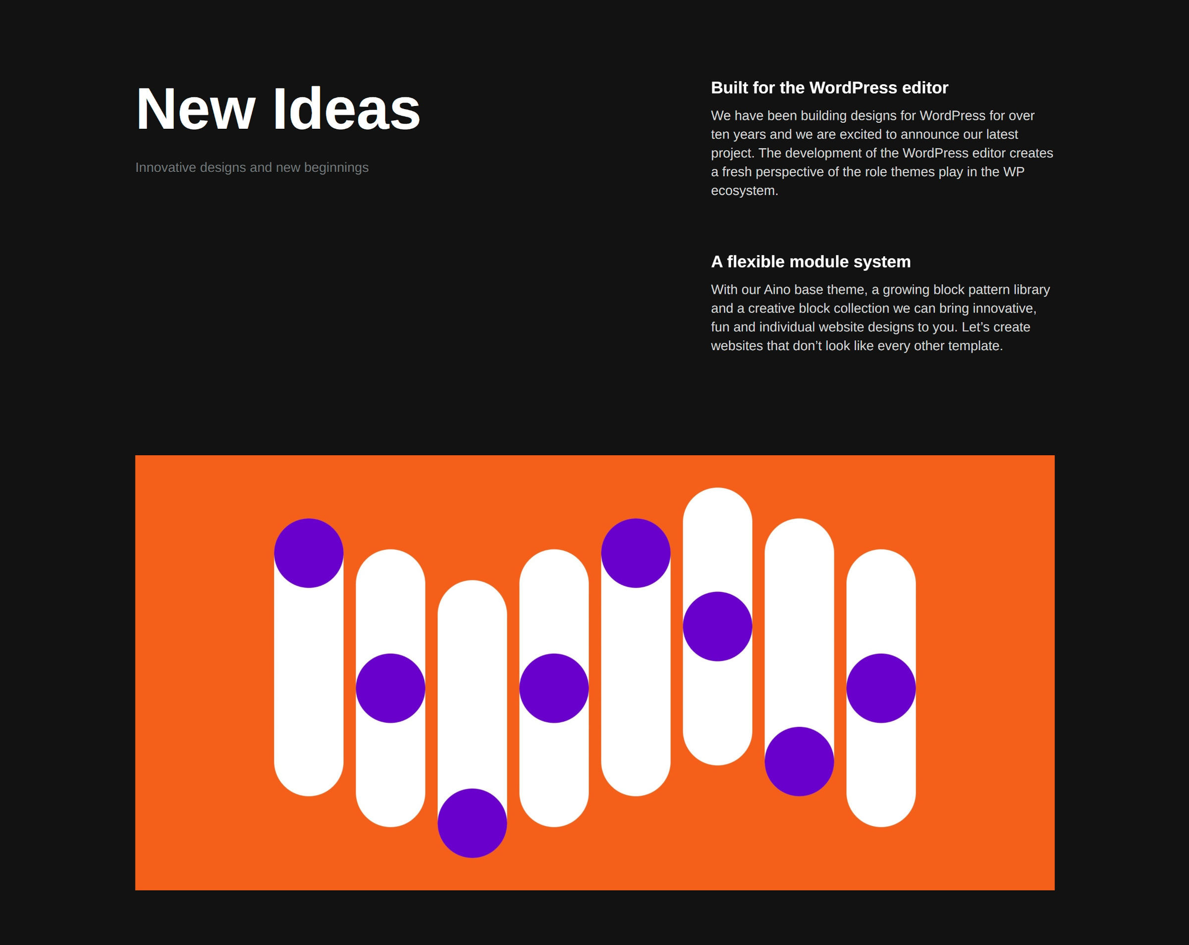
Today, this looks much different. The Aino theme comes with — count ’em — 42 block patterns. It is also where this project shines. I may have mentioned something about this being the route to go last year:
The company’s best bet is to focus on building patterns. Its first pattern shows some promise. I am holding out hope for more interesting work to come.
The team took that dev-friendly base of the Grid block and built a system of easy-to-use layouts on top of it. Users merely need to click to insert and customize.

Because Aino’s patterns are built upon this grid foundation, the design studio’s layouts are fine-tuned for each screen size.
Unless other theme authors build on top of the same plugin or a similar grid-based block, they are left with stock WordPress/Gutenberg. This provides limited options for responsively designing more complex layouts. This should be a focal point of the WordPress 5.9 release cycle, but it could be a while before we have something as powerful as the various grid blocks available via plugins.
ElmaStudio’s groundwork in the previous two years is bearing fruit, at least in terms of what the team can create. With the foundational elements in place, nothing should stop them from building the next 42 patterns and more.

I am still lukewarm about most of the blocks in the plugin, think the Hero and Testimonial blocks should just be patterns, and the [Aino] Buttons block should be an options extension for the one in core. The Grid layout is the feature that all the best things about the Aino project hinge on.
The Aino theme itself seems unimpressive on its own, at least at first glance. However, the project is not whole until it is coupled with the Aino Blocks plugin.
The theme needs some design work on its default spacing. For example, paragraphs that follow a wide or full-aligned block have no gap above them. Blockquote text butts against the side of the left border. Trivial bugs like these are easy fixes. Sometimes, it is not evident that there is an issue until a Gutenberg plugin update, which often leaves theme authors chasing changes. Such is the life of a designer living on the bleeding edge, supporting the latest features via a block theme.
I am happy I once again had the opportunity to dive back into the Aino project. A year makes a difference, and the duo behind the theme and plugin has made use of the time. Right now, they have a solid project for users who want to build out their pages with blocks. There are enough patterns for just about any website owner.

