It is hard to believe that it was over a year ago — March 23, 2020, to be exact — that I wrote a post on why block patterns would be the future of WordPress. It has been a slow process as I have patiently waited for the feature to mature into a powerful tool for end-users. I am still as much a believer now as I was then.
WordPress is betting big on patterns too. The feature is now a top-level site-editing component with several sub-features under development. As Gutenberg project lead Matias Ventura noted, “From directory browsing to placeholder setup to transformations, patterns are crucial component of the entire site editing scope.”
A year ago, patterns were just an idea, almost a footnote compared to other upcoming features. Since WordPress 5.5 included the Patterns API for developers, over 100 themes in the official directory bundle them.
A new pattern directory is launching on WordPress.org next month alongside the version 5.8 release. There are already over 30 community-contributed patterns approved. More are likely to land in the coming weeks. The directory will also eventually be open to anyone who wants to submit new designs. Any WordPress user will have the choice to select from this collection directly from their WordPress admin interface.
These ideas are just scratching the surface.
At its core, the block patterns feature is a simple way of bundling one or more blocks into a preconfigured design. Users can point and click to insert them into their post or page content. The goal of the block system is not just to be a page builder where users must create everything from scratch. While we want it to be flexible enough to do that, most users should have the ability to simply insert sections of a design and customize them. This could be as simple as an audio player with a background to a portfolio layout that showcases their latest projects.
Right now, the user experience is only set up to handle a dozen or patterns at a time — too many choices can be a less-than-ideal adventure. As the library grows, the interface will need to evolve with it.
How can we build experiences on top of this foundation that mitigates some of the complexity?
The Gutenberg development team is already working on multiple solutions, such as contextual suggestions for a selected block. However, one of the more promising features is patterns registered for specific block types. In this case, template parts.
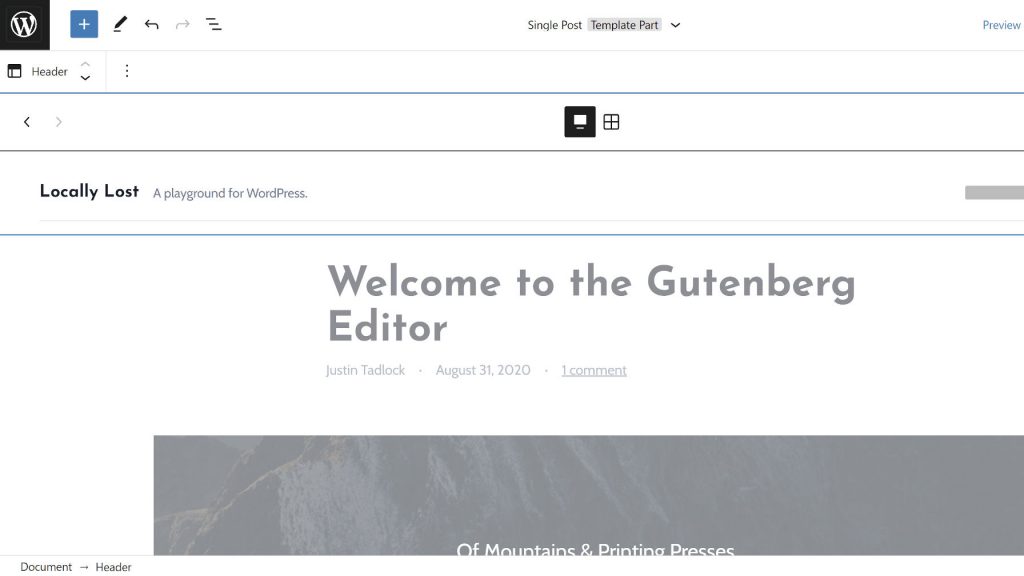
For example, if a user wants to select a new pattern for the header of their website, they should not have to sort through every option to find something. With Header patterns, the editor presents the user with a carousel of choices to scroll through specific to that template part.
This same feature is possible with footers too:

Those who have been beta testing WordPress 5.8 or running the Gutenberg plugin in the last few months may have noticed some similarities to the Query Loop block (formerly named Query). It is the same underlying system that allows developers to attach patterns to a specific block.
Users can already select from multiple Query Loop patterns when first inserting the block:

“Recent improvements to the Template Part and Query Loop blocks has opened up a whole new world for how patterns can be used,” wrote Kjell Reigstad in a recent ThemeShaper blog post. “Both blocks can now display a carousel of block patterns in their setup state, allowing users to choose between a menu of pre-designed versions of these blocks. These patterns can be bundled with your theme, so that users have a wide range of pre-designed header, query, and footer options available to choose from in the Site Editor.”
Reigstad has an open ticket for several core header and footer patterns. The following is a short video clip of how this works:
As any theme developer knows, you cannot simply plop anything into the header and make it look good. It is one of the most specialized areas of theme design. One wrong turn and the entire design falls apart. The downside to this feature will be third-party patterns coming from the directory. Some will work. Others will not fit into every theme design, but they are not necessarily meant to. It could be a support nightmare for theme authors or an opportunity.
Theme developers will be able to steer their own ship, offering a range of choices that are perfectly molded to their designs.
I can already see it…multipurpose themes with 50+ header patterns listed in their marketing material.
While it is unlikely that many people had this in mind during the conceptual stages of block patterns, they are evolving. They will be more than just something users can stick into their post content at random. They are that semi-controlled experience that will give users the flexibility of choice, but the theme serves as a guide for making intelligent decisions.
If a theme author offers four or five well-designed Header or Footer template patterns, users are more likely to select from those. It is easier than building from the ground up.
Such a system also opens more commercial opportunities. Imagine upselling specialized pattern collections for niches. A restaurant site header might want to focus on an “order online” button. A news website could feature a “latest stories” ticker above the site title and navigation. There are endless ideas, all awaiting a savvy theme developer to implement and monetize them.
As always, I am eager to see where patterns go. They are still the most exciting WordPress feature, offering the API that theme authors have needed for the past decade.

