The Gutenberg plugin continues to march forward. Yesterday’s release, coming merely a day after the launch of WordPress 5.8, brings several new features and nearly three dozen bug fixes. The big-ticket items are drag-and-drop blocks in the list view and a much-needed upgrade for border support.
Theme authors should enjoy the ability to control the Columns block’s stacking on mobile and some updated design controls for nav menus. While labeled an “enhancement,” themers should also check their designs against a breaking change to the RSS block’s updated styles.
Drag and Drop Blocks in List View
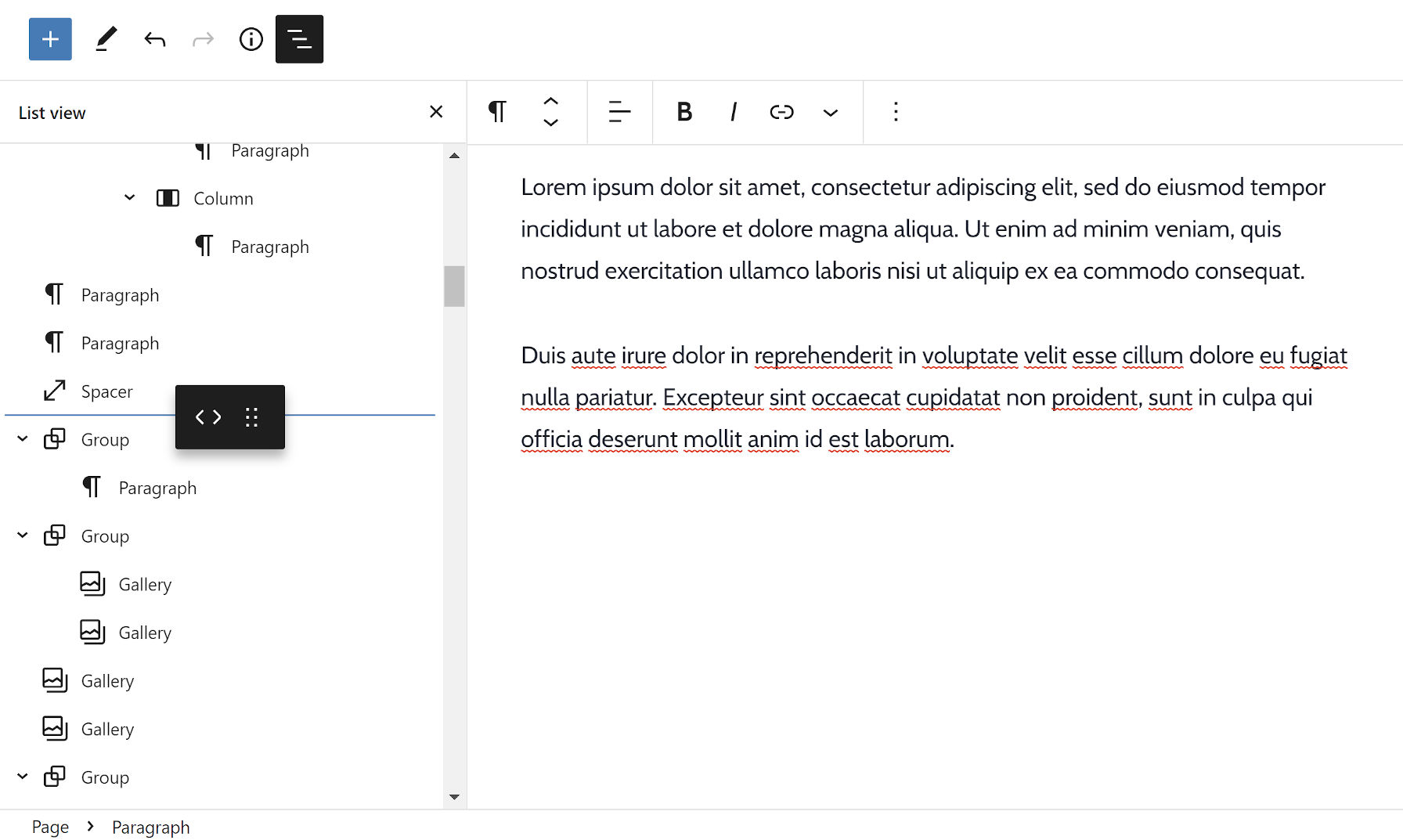
Drumroll, please. The moment we — or at least many of us — have been waiting for has finally arrived. The editor’s list view has become a powerhouse for managing long documents with many blocks. Over the past dozen or so releases, the development team has continued to tack on necessary feature after necessary feature.
In version 11.1, users can drag and drop blocks from within the list view to order and organize content. However, users are not merely limited to moving things around within the list view itself. They can drag blocks from the list over into the content canvas and vice versa.
I do not often use emoji, but sometimes I like to dole out a slow clap for a job well done. 👏 👏
Border Support
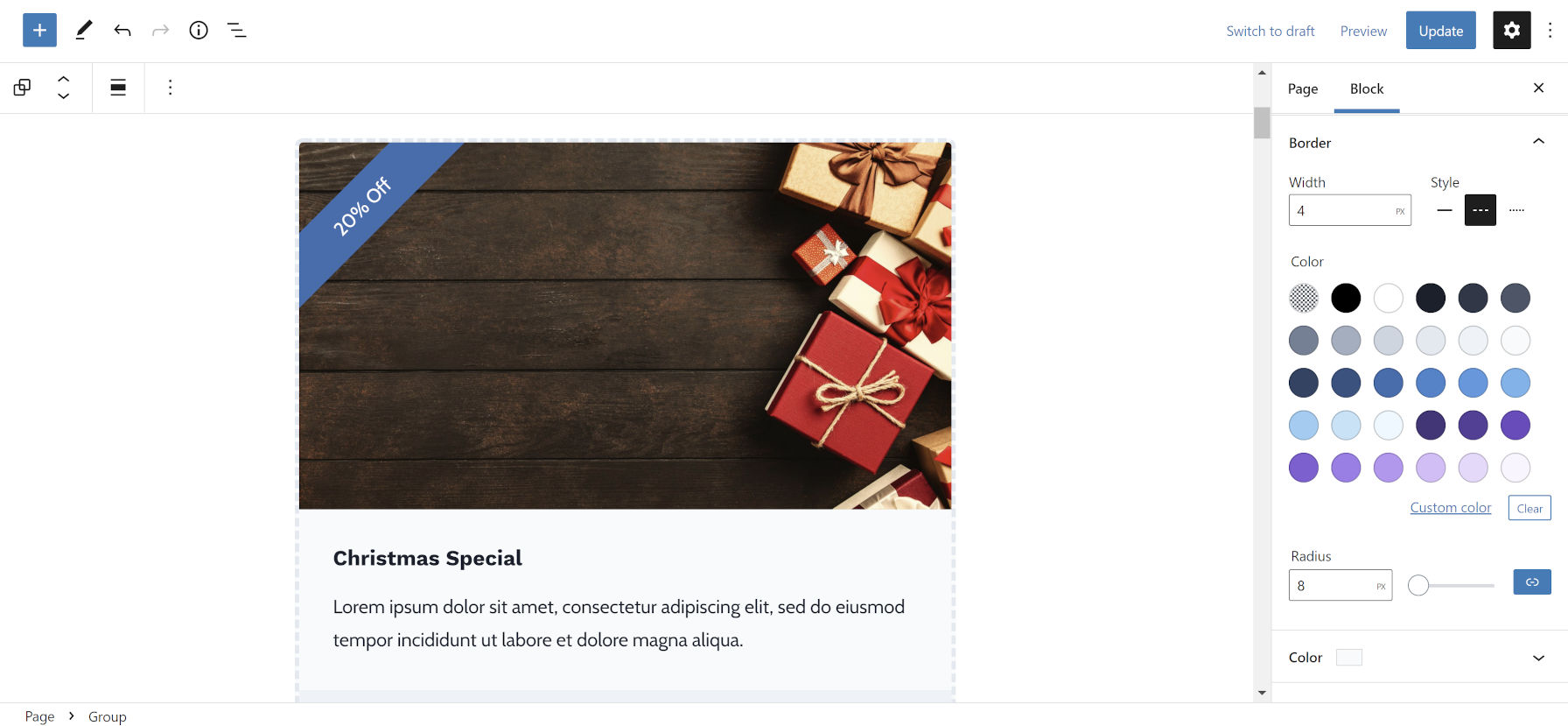
I have already been having a bit of fun with the new border options. Lately, I have been in the holiday spirit because I was getting ahead and buying my Christmas tree in July (when you find the good deals). This inspired me to create a coupon code block pattern, and the Group block’s border support was perfect for this.
Gutenberg 11.1 refines the user experience for border options. The development team tightened the UI and placed the settings into logical groupings.
Only the following core blocks have partial or complete border support:
- Button
- Group
- Image
- Search
- Table
Users can also define individual corners with the border-radius option in this update. I would love to see the same treatment for the top, right, bottom, and left borders in the future. I also would not mind seeing a double-border style.
Columns Block: Stack on Mobile
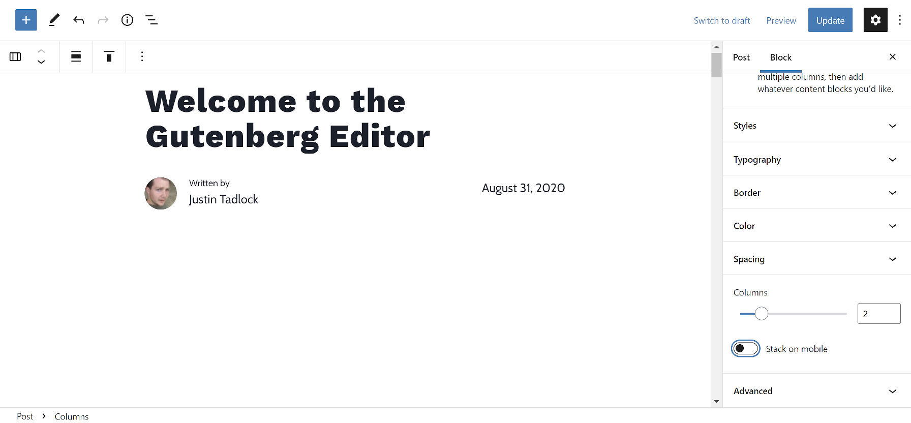
By default, individual Column blocks will stack on top of each other in mobile views. However, users can now disable this via the parent Columns block on a case-by-case basis. This has also been one of the missing pieces for more layout control in block themes.
One of the primary use cases for a Columns block that does not break on mobile devices is post metadata sections that should be inline. For example, theme authors often want to align the post author, date, and comments link in a single row below the post title.
This toggle switch sort of moves us in that direction. However, it is a stopgap solution that does not afford theme designers the flexibility they are accustomed to with CSS (this is not generally a complicated affair).
Before block themes and the site editor are rolled into core WordPress, theme developers will need fine-tuned responsive control over the Columns block and, perhaps, some type of row/inline/flex block to go along with it.
Theme authors who need to target the Columns block based on whether mobile stacking is disabled can use the .is-not-stacked-on-mobile class.
Post Terms and Tag Clouds
The development team has crossed one of my months-long pet peeves off the list. In past releases of the plugin, the Post Terms block (variations of Post Tags and Post Categories) has displayed a pipe (|) separator between individual items by default. It now shows a comma, followed by a space.
Theme authors can change this in their block templates, and users can customize it from the editor. The setting is located under the “Advanced” tab in the block options sidebar.
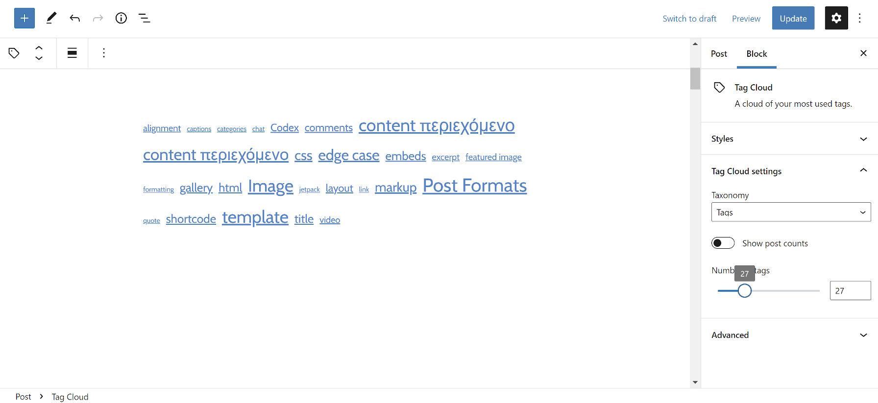
The Tag Cloud block got a small but much-needed upgrade. Users can now set a limit on the number of tags to display. By default, it is set to show 45 tags.
Navigation Submenu Colors
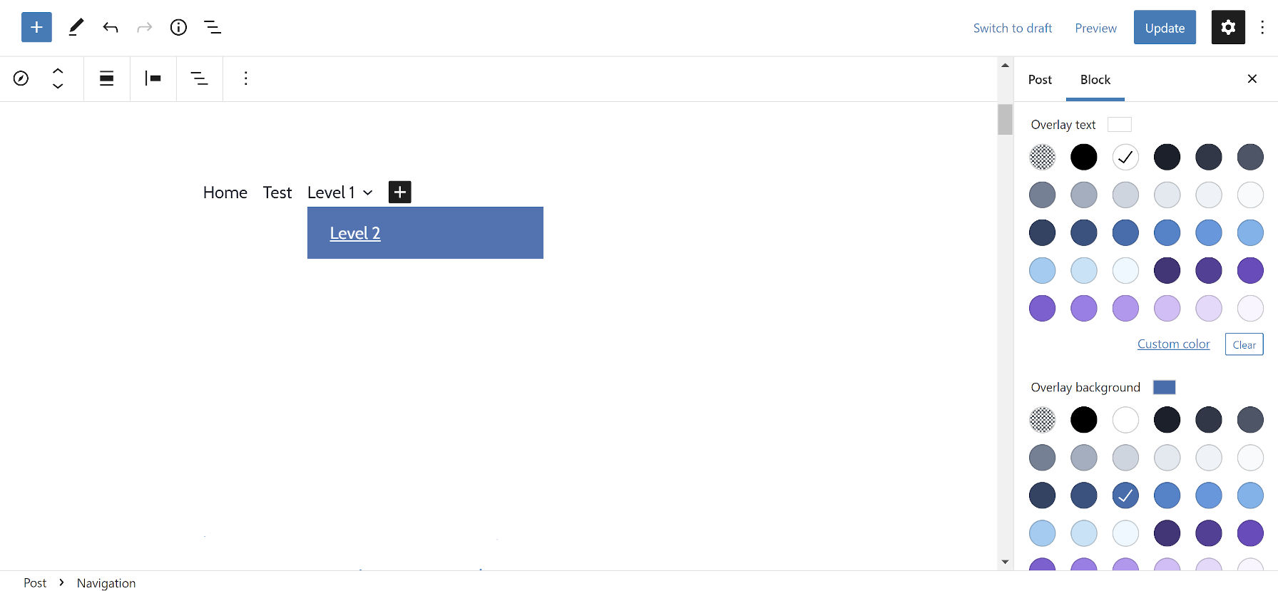
The Gutenberg development team added two new color options for the Navigation block. Aside from its existing text and background colors, users can now change the text and background colors for submenu items.
The Navigation block, while improved, still seems to be one of the trickiest pieces of the site-editing puzzle. It is trying to be the Jack of all trades, mastering few — if any — solutions. And, there is already a ticket gaining traction that would allow users to stuff a wider range of inner blocks into it.
But, we have submenu text and background colors, which is a win. Only, they are named “Overlay Text” and “Overlay Background.” I am unsure whether it works as part of the mobile responsive menu. Gutenberg seems to have once again failed to bundle its front-end navigation JavaScript.
