It has been a while since I have touched widgets. Once the site editor landed in the Gutenberg plugin, I almost exclusively dropped the old sidebar paradigm and moved to block templates. Reactivating old themes and jumping into the widgets screen felt like time-traveling into a bygone era.
After months of being deeply embedded within block themes, it is hard to imagine moving back to the sidebar widgets system that most WordPress users are still using today.
WordPress 5.8 is slated to ship with a small taste of bringing blocks outside of the content editor. However, it can feel like a surface-level refresh of a dying system, one that does not always work.
Block-based widgets are part of the transitional phase between classic WordPress and the future, which centers on a complete site editor. Once the bulk of themes are built atop blocks, the need for widgets will wane. The site editor and block themes do not support the old sidebar system. Instead, users will be able to place blocks anywhere.
Last October, I asked the question: Are Block-Based Widgets Ready To Land in WordPress 5.6? At the time, the widgets screen was expected to launch with the final release of 2020. However, the development team pulled back on the feature’s inclusion, primarily because the customizer implementation was sub-par.
Asking the same question of WordPress 5.8, my answer is mostly the same. It is time to ship the current feature and prepare for a future without widgets. There are so many components that are far more exciting around the corner. The primary user-experience issues will linger around until users have moved on to block themes.
I have long been in the camp of starting from a clean slate for block themes, letting widgets die out. However, the path WordPress has chosen is to create this stepping stone for users who may be on traditional themes for a while. It provides an opportunity to use blocks outside of the editor, which may be a leap forward for many.
With the vast number of libraries, one-off blocks, and support from plugin authors, users have a wealth of block choices at their fingertips. Right now, if there is no equivalent widget, those users can only ever use those blocks in their content. Within a block-widget system, that limitation does not exist.
It also lifts some burdens from developers. Those who want to shed some of their old code and go all-in on blocks can begin considering deprecating or retiring widgets.
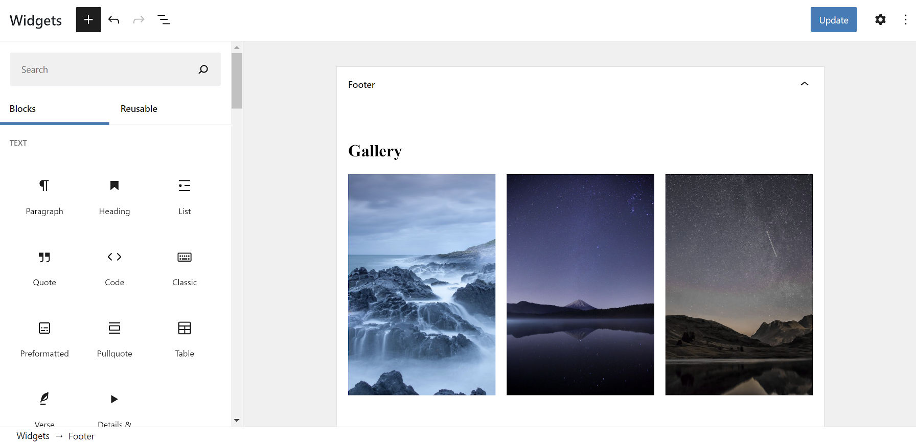
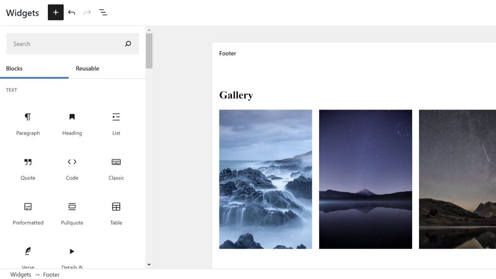
Transitioning to the new Widgets screen should feel simple to users familiar with the WordPress content editor. Inserting blocks is the same. The difference is that each sidebar has its own container.

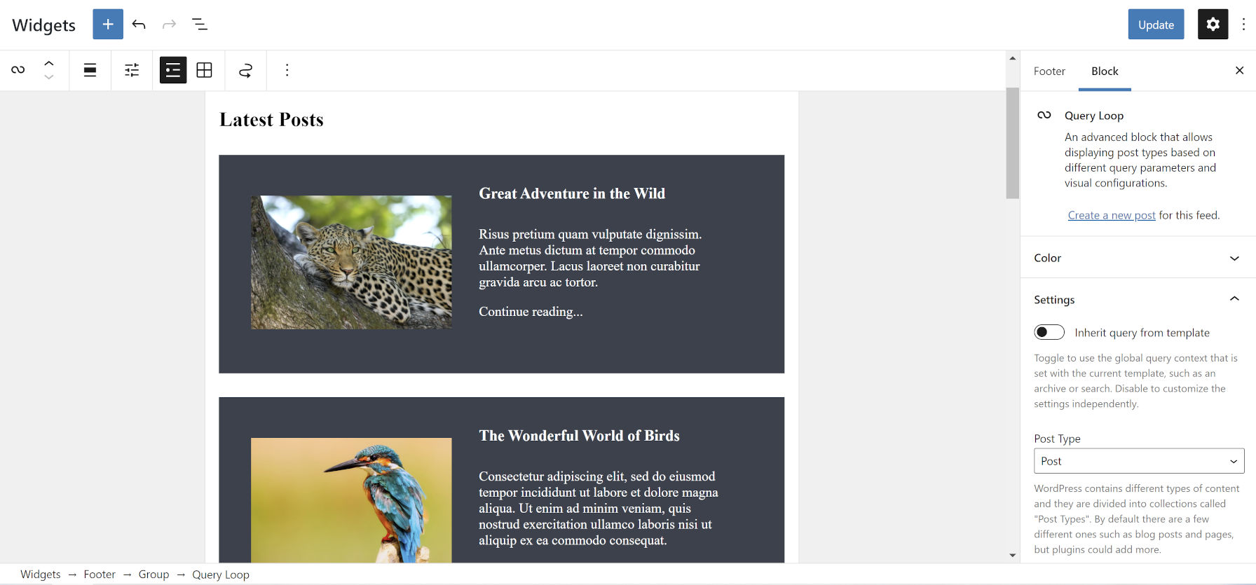
The range of blocks within core WordPress could also let users drop some of their widgets-based plugins. One of the most popular types of widgets over the years has been for handling post lists. There are dozens of such plugins and an untold number of themes that include one. Coupled with WordPress 5.8’s Query Loop block, users can now recreate many of those widgets themselves.

Much of this depends on the theme’s design support of blocks and whether it will accommodate anything other than traditional widgets.
Customizer support for block widgets is lightyears ahead of where it was just a few short months ago. However, it feels awkward at best. There is a deep feeling of not belonging. While it was a remarkable programming feat to make the two features work together, the user experiences are nearly a decade apart.

Despite the customizer providing a live preview, the Widgets screen in the WordPress admin gives the necessary workspace. Trying to squeeze the block editor into the tiny customize controls panel was never going to be an ideal experience, and it still is not. It gets the job done, but I recommend the traditional widgets screen for fewer headaches.
Problems Remain
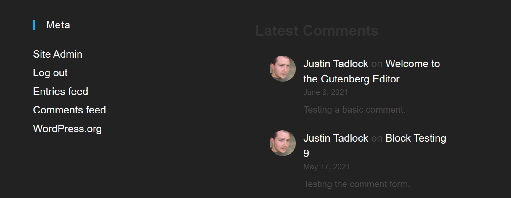
In the eight months since I first dived into the block-based widgets, the system has been overhauled. However, the potential issues I brought up remain. Just dropping blocks into a sidebar can have mixed results. For example, compare a Legacy Widget to Heading and Latest Comments blocks in the footer sidebar of the popular OceanWP theme:

The issue is that WordPress treats every block as a widget. Traditionally, widgets have had both a title and content. Blocks have no such concept. A Heading followed by something like a Paragraph, Latest Comments, or another block has no special meaning in the block system. They are all treated separately.
This issue is in full view when adding blocks to the default Twenty Twenty-One WordPress theme:

Notice the Heading and Latest Comments blocks are columnized because they are seen as separate widgets.
To address this, users must add multiple blocks into a Group block if they want them treated as a single “widget.” It is a simple matter, but it could still be a usability hurdle for some.
Even with a fix in place, there is no guarantee that blocks will appear as the widgets the theme author intended.
I long ago gave up on the hope that there would be better handling for block widgets. The Classic Widgets plugin is available for those who need it, and theme authors can opt-out. These are necessary tools for an experience that can range from downright awesome to utterly broken.
Bringing blocks outside of the content editor for traditional theme users is probably necessary for the transition, but the current site editor experience already feels much smoother than block widgets. The long-term focus should be on moving away from the dated concept of widgets and into a WordPress front-end 100% built on blocks.

